Print Design & Branding
Toggle a client name below to view projects details and images.
client details
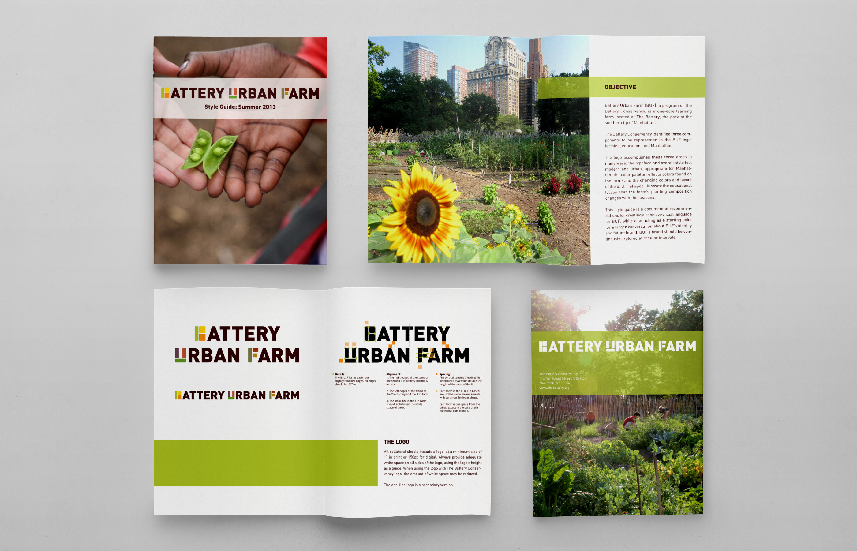
Battery Urban Farm • New York City
Logo design, style guide, branding
Summer 2013
Started in 2010, Battery Urban Farm is a project of The Battery Conservancy. Battery Urban Farm is an educational farm within the historic Battery Park at the southern tip of Manhattan. The Farm’s mission is to empower kids and the community through garden education; inspire the creation of edible gardens in NYC and globally; and cultivate awareness of sustainability.
project description
As a project of The Battery Conservancy, Battery Urban Farm never had its own identity. Their collateral materials used the Farm’s name in plain text in conjunction with the Conservancy logo. In 2013, Battery Urban Farm was ready to emerge from under the Conservancy’s visual identity. Battery Urban Farm wanted a logo that touched on three specific areas: urban farming, education, and Manhattan. Additionally, the Farm logo needed to pair well alongside the Conservancy logo.
The final design successfully layers many aspects of the organization’s identity:
- the typeface and overall style is modern, architectural, and urban, a reflection of Manhattan,
- the color palette embodies hues found on the farm and in nature, and the B, U, F colors represent seasonal changes, and
- the B, U, F shapes allude to the educational lesson of garden composition.
Battery Urban Farm also requested a style guide to ensure that their new logo would be used cohesively across materials and media. The style guide addresses: how to use the logo including details on how to recreate the logo; how not to use the logo; the optimal color palette and typefaces; and more. The style guide also serves as a foundation for larger and future conversations about Battery Urban Farm’s growing brand and identity.
client details
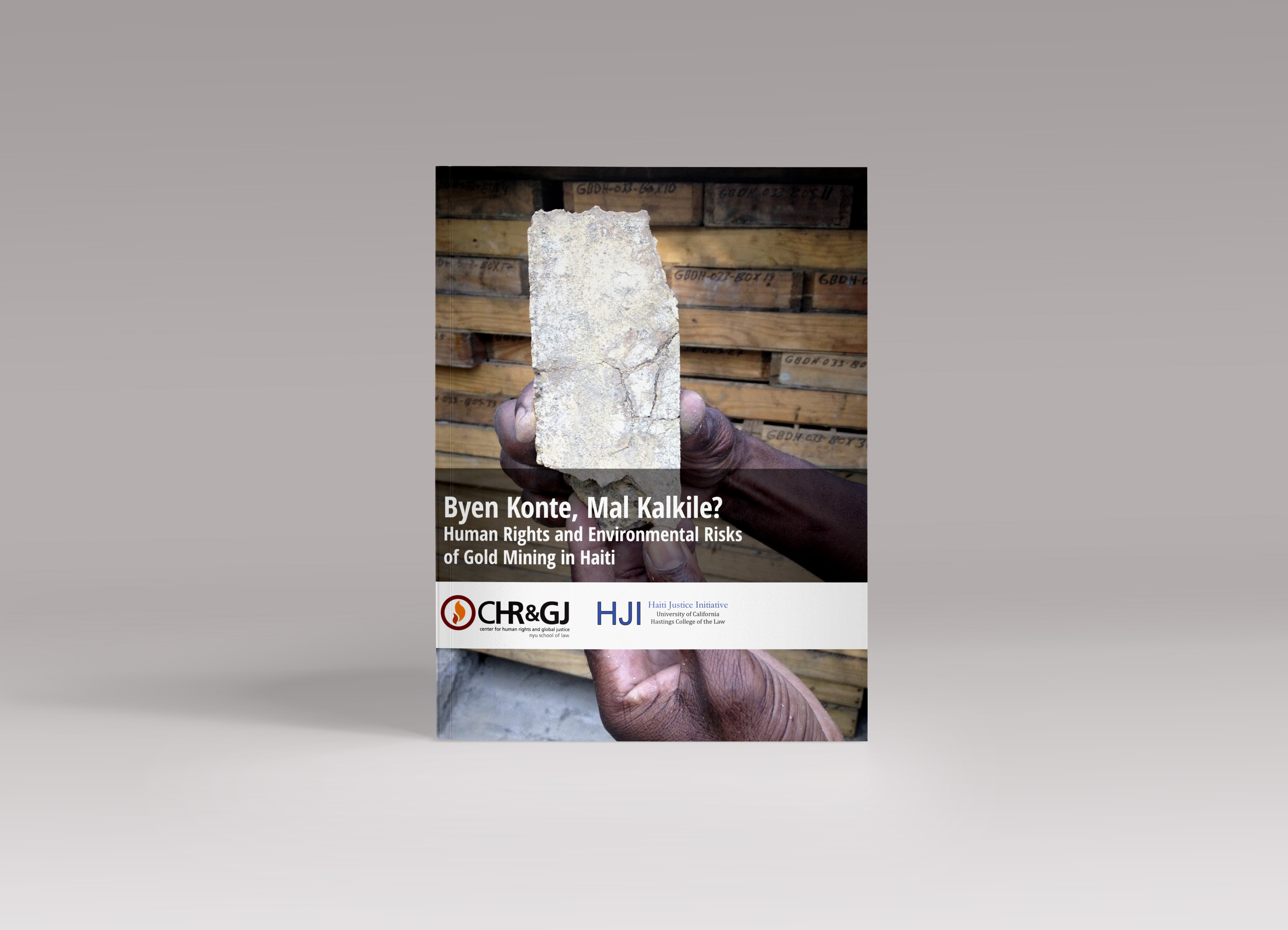
Center for Human Rights and Global Justice • New York City
Special report on Haiti, 278 pages
Winter 2015
The Center for Human Rights and Global Justice is the hub of human rights study at New York University School of Law. The Center aims to: generate substantive, cutting-edge and sophisticated contributions to human rights research and legal scholarship; and actively engage in public affairs and make original and constructive contributions to on-going policy debates relating to human rights.
project description
In collaboration with John Emerson, I created a design for the Center’s special report entitled, Byen Konte, Mal Kalkile? Human Rights and Environmental Risks of Gold Mining in Haiti. The 278-page document was a particular challenge because the client wanted the document designed in Microsoft Word (rather than Adobe InDesign). The text was still undergoing editing, and the client wanted full-access to edit the document until it went to print. Considering the project’s under-the-gun deadline and having to design in Word, I’m quite pleased with the result and am glad for the opportunity to sharpen my Microsoft skills.
As is common with long documents, I paid special attention to the hierarchal visual elements—chapter and section titles, lists, folio elements, pull quotes, etc.—in order to ensure the reader is able to explore the information efficiently. Click here to go to the Byen Konte, Mal Kalkile report page.

client details
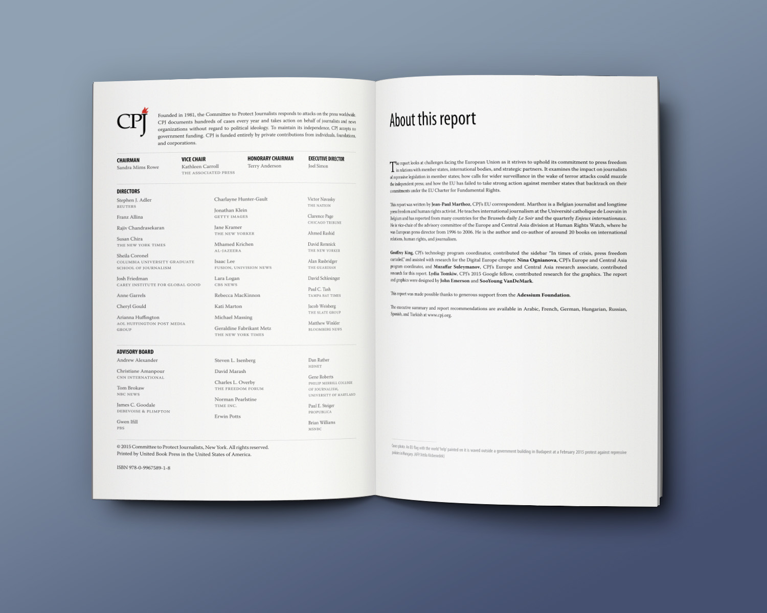
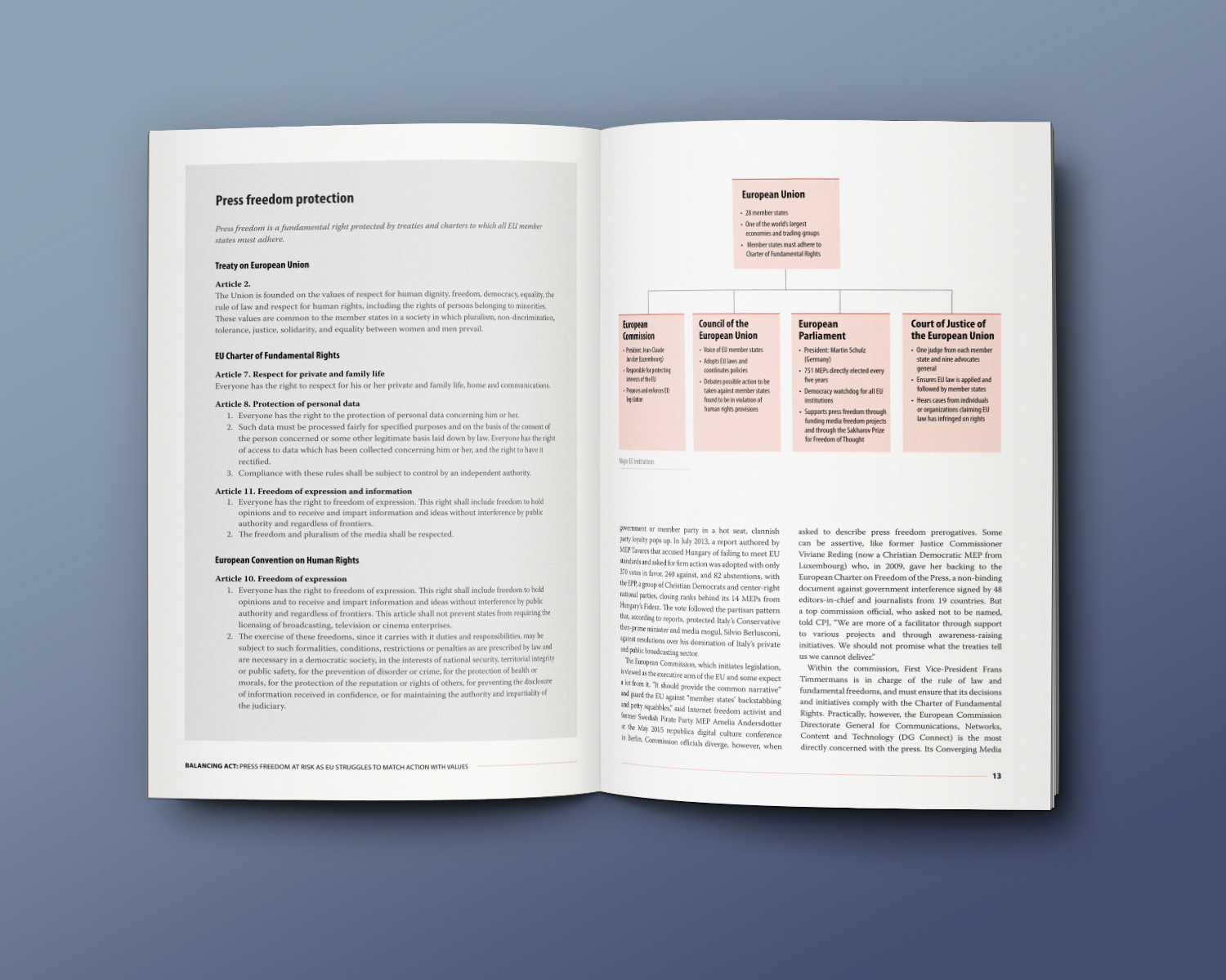
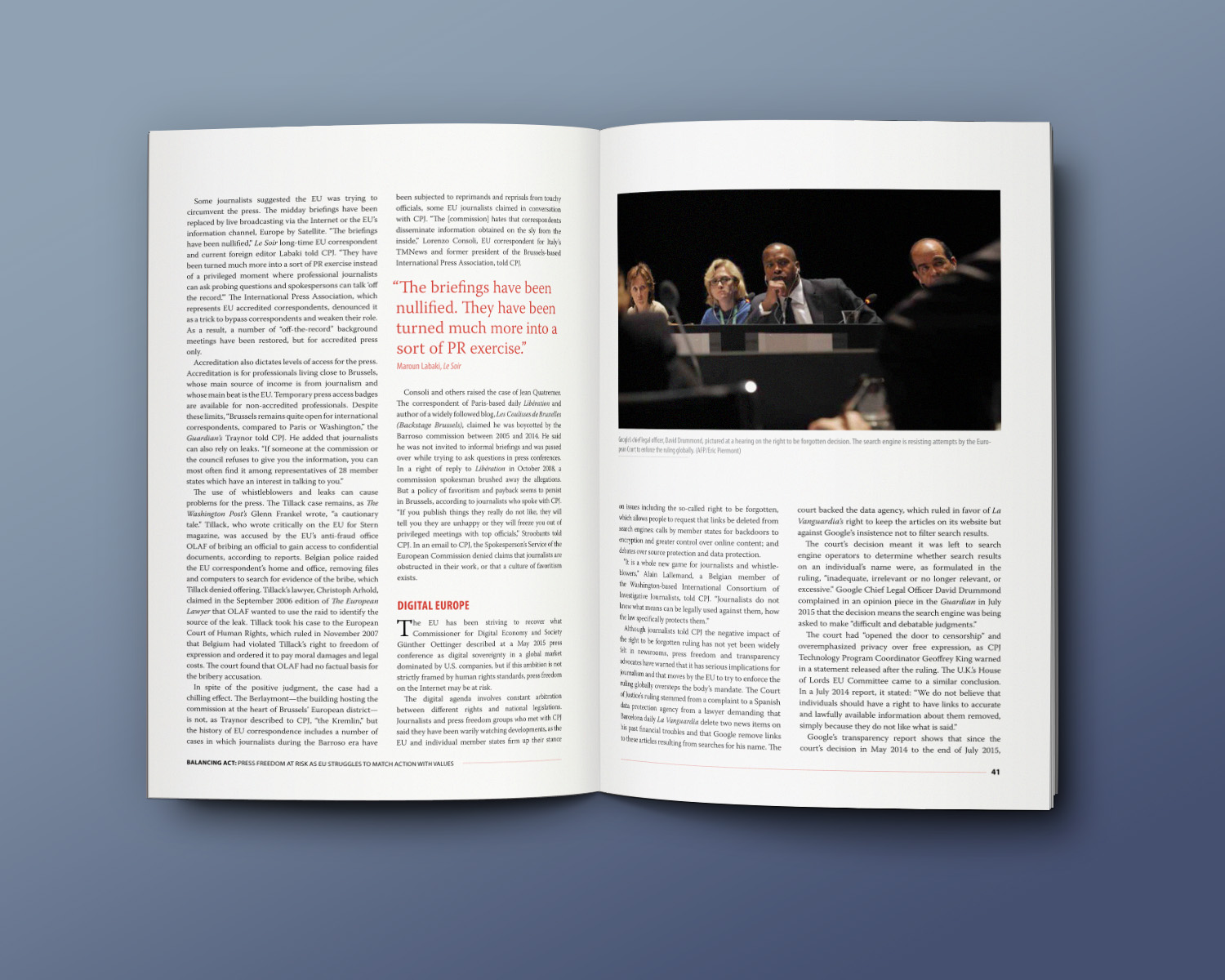
Committee to Protect Journalists • New York City
Special report on Press Freedom, 71 pages
August 2015
The Committee to Protect Journalists is an independent, nonprofit organization that promotes press freedom worldwide. CPJ ensures the free flow of news and commentary by taking action wherever journalists are attacked, imprisoned, killed, kidnapped, threatened, censored, or harassed.
project description
In collaboration with John Emerson, I worked on the design and layout of CPJ’s 71-page special report entitled, Balancing Act: Press freedom at risk as EU struggles to match action with values. Having previously worked on CPJ’s website redesign in 2013, I was familiar with their branding, and used that to guide me in creating styles for the report. As is common with long documents, I paid special attention to the hierarchal visual elements—chapter and section titles, sidebars, folio elements, pull quotes, graphics, etc.—to ensure the reader is able to explore the information efficiently. Click to go to the Balancing Act report page.


client details
Greenpoint Community Environmental Fund • Brooklyn, NY
Collateral (letterhead, brochure, newsletters); Event materials (posters, flyers, postcards, signage); Newspaper ads; etc.
August 2014 – Ongoing
The Greenpoint Community Environmental Fund is a $19.5 million grant program created with monies obtained through a settlement with ExxonMobil over its Greenpoint oil spill. GCEF’s goal is to fund projects that will address the Greenpoint community’s environmental priorities through a process that is open, transparent, and ensures ongoing engagement and partnership with the community.
project description
GCEF wanted to ensure that all community residents had the opportunity to participate in the program–as a grantee, by voting for a project, and/or attending meetings. They had a great need for a variety of materials that would appeal to a broad audience. Almost all the materials were provided both online and in print, as well as translated into Polish and Spanish (the most common foreign languages in the community.) I was responsible for designing and producing the majority of these materials (event flyers, program brochures, newspaper ads, etc.), often managing budget, asset collection, printing, deadlines and other project details.
My role with GCEF extended beyond print designer. I assisted with the recovery of their website from malware, moving it to a more secure host. I am currently responsible for the GCEF’s website maintenance and content management. Click to view my web-related work for GCEF.

client details
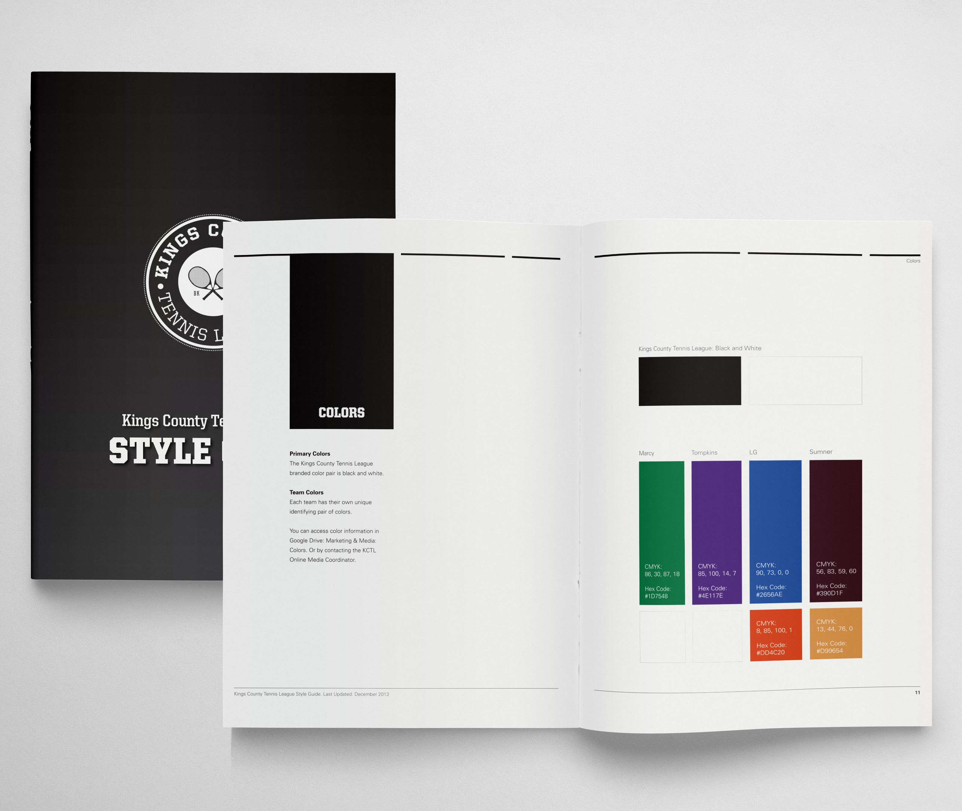
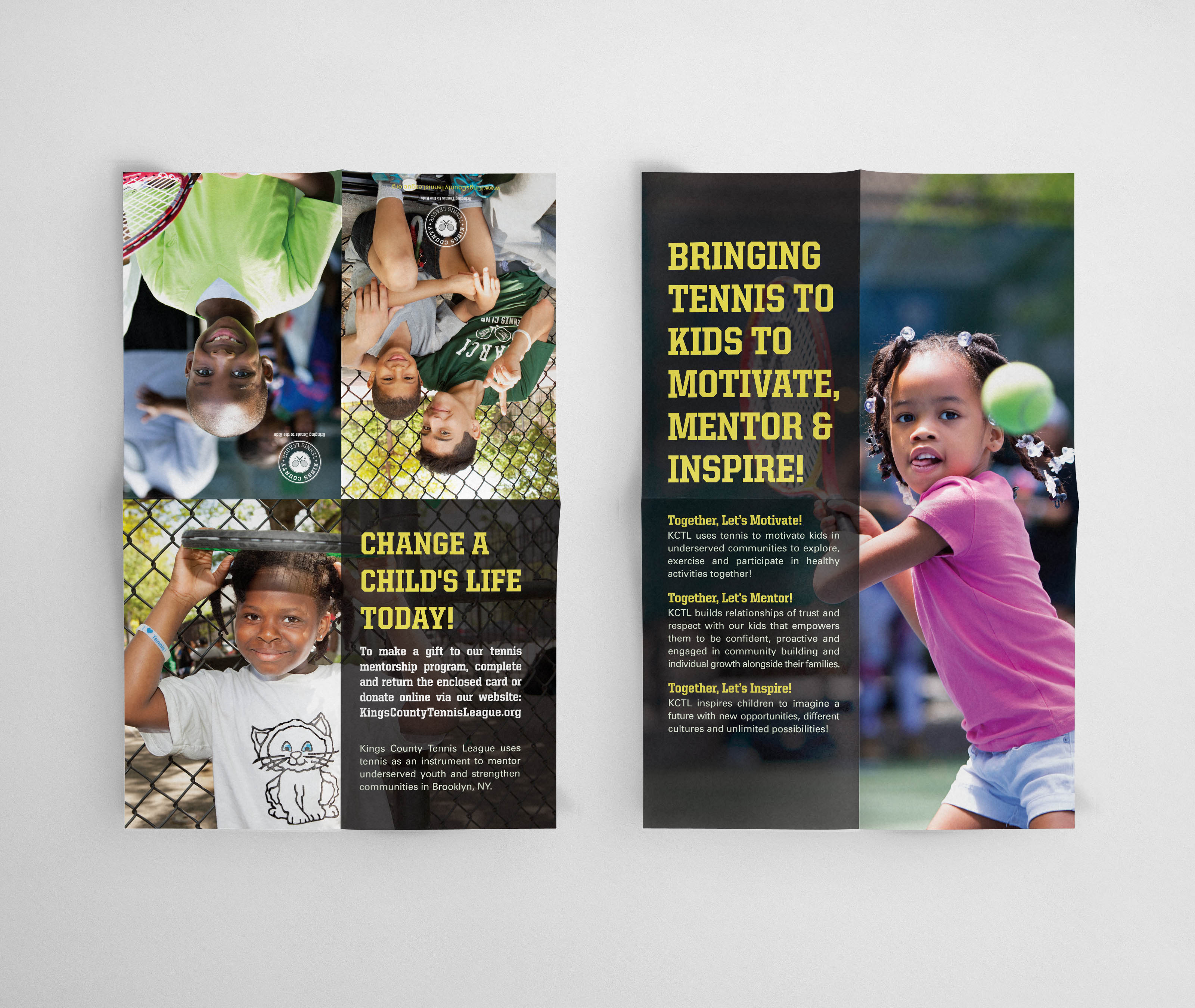
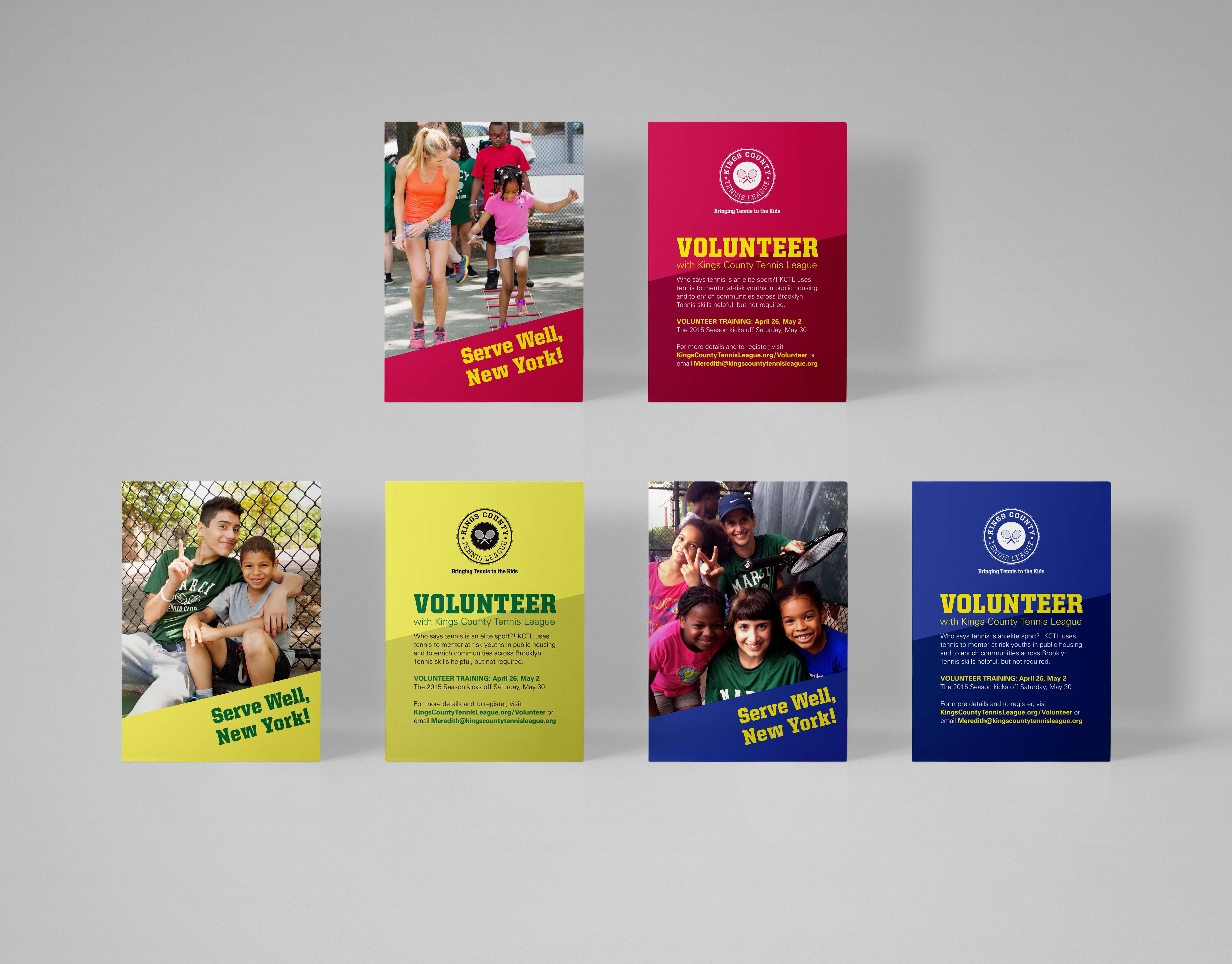
Kings County Tennis League • Brooklyn, NY
Responsible for all designed materials, brand management
May 2012 – February 2015
Kings County Tennis League is a free tennis program that serves over 100 kids at four New York City Housing Authority (NYCHA) locations in Bedford-Stuyvesant, Brooklyn. KCTL uses tennis as an instrument for youth development and mentoring, and community building. Note: I was also a KCTL volunteer instructor/mentor for four years at Tompkins Houses.
project description
KCTL grew rapidly in 2012 and needed an expanded presence online and in the community. Working with the executive board, I devised a strategy for their print materials, website and social media to communicate with their diverse audiences: youth athletes, parents, volunteers, sponsors, donors, community leaders and the general public.
As KCTL grew, each site received its own specific logo and colors. I put these four logos, the primary KCTL logo, and the site colors together into a coordinated branding system to be used across all materials and mediums. Designing this system helped streamline the administrative work for KCTL, for example, organizational documents for 100+ youth athletes, parents and volunteers across four locations, as well as top-level KCTL documents, became instantly recognized and easily filed by color.
In addition to creating and implementing the brand, I protected it. As KCTL’s reputation broadened in the community, a consistent visual approach made soliciting donations and fundraising easier, better received, and importantly, more memorable. Even though the program was young during my tenure (less than five years old), KCTL was routinely perceived as more experienced and well-organized, in part due to it’s coherent branding strategy.
My role at KCTL extended beyond print designer. I also acted as copywriter, online content editor, social media manager, publicity contact, intern supervisor, photographer, community representative, head of the fundraising subcommittee, event management, and more. Click to view my web-related work for KCTL.
client details
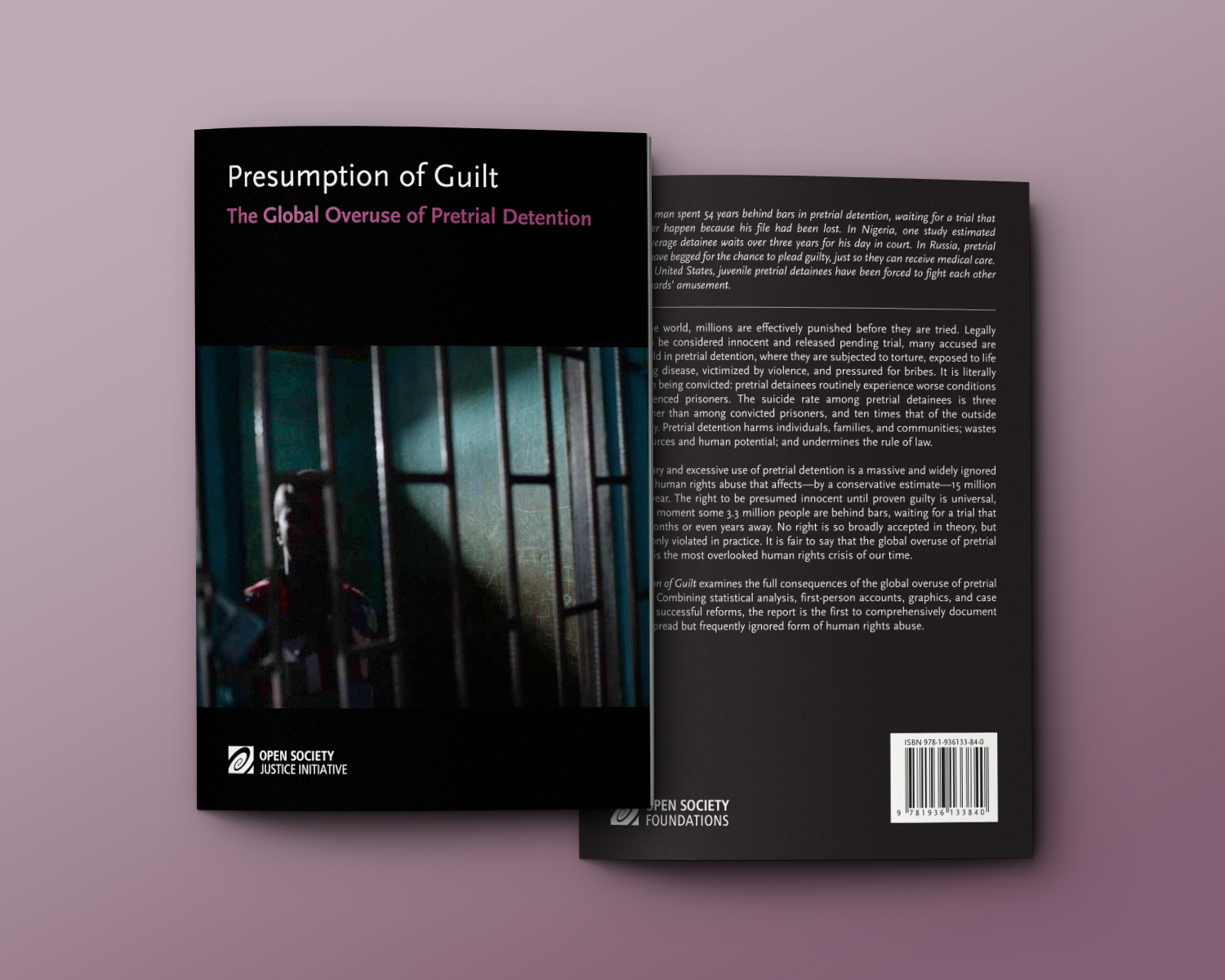
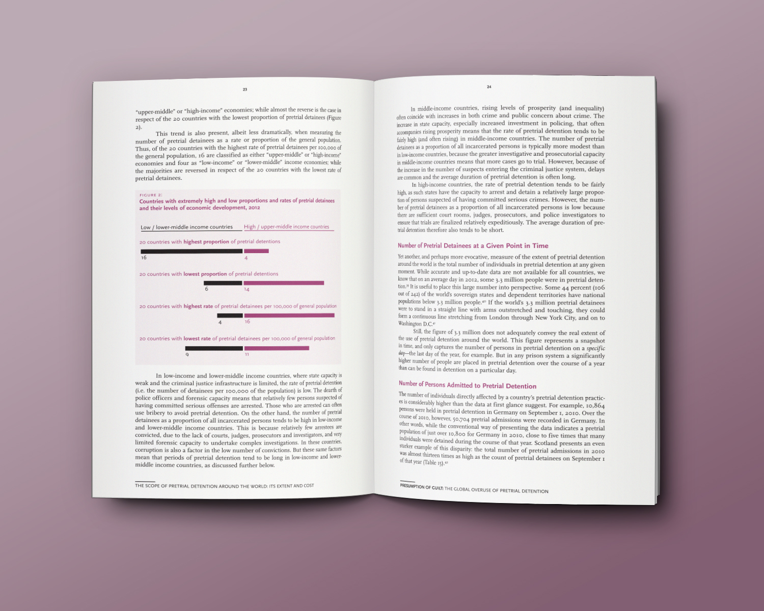
Open Society Justice Initiative • New York City
Special report, 270 pages
Summer/Fall 2014
The Open Society Justice Initiative uses law to protect and empower people around the world, supporting the values and work of the Open Society Foundations. Through litigation, advocacy, research, and technical assistance, we strive to secure legal remedies for human rights abuses, and promote effective enforcement of the rule of law.
project description
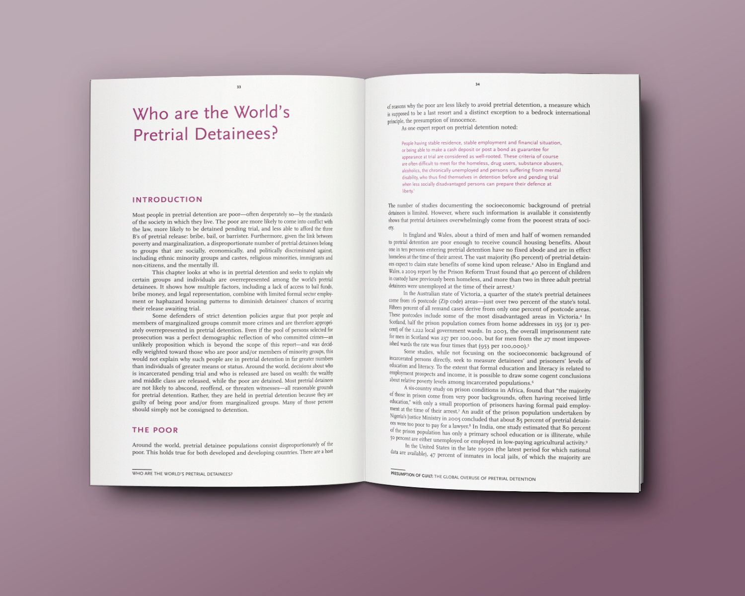
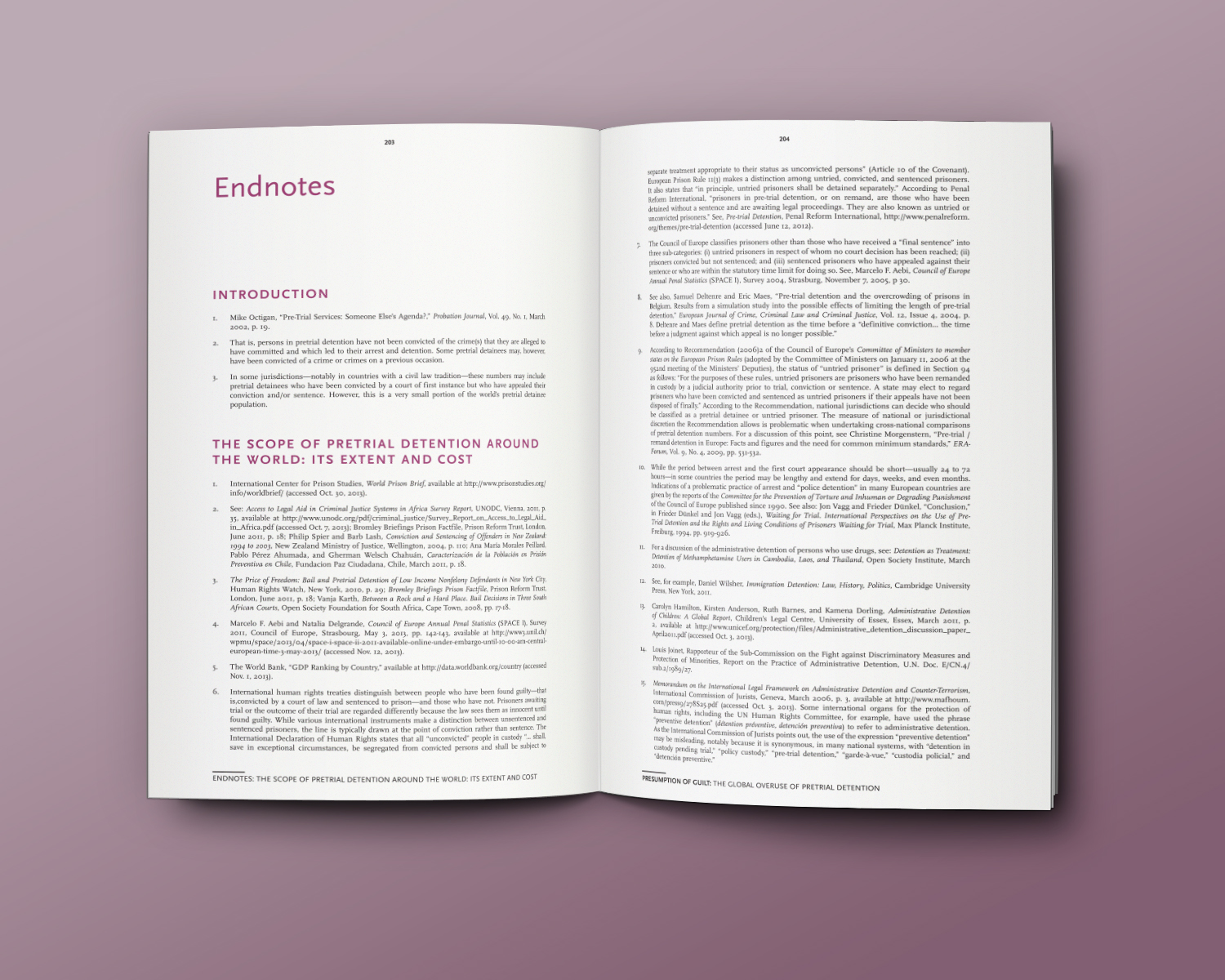
In collaboration with John Emerson, I worked on the design and layout of OSJI’s 270-page special report, Presumption of Guilt: The Global Overuse of Pretrial Detention. As is common with long documents, special attention was placed on the hierarchal visual elements—chapter/section/subsection titles, lists, folio elements, pull quotes, tables, etc.—to ensure the reader is able to explore the information efficiently. Click to go to the Presumption of Guilt report page.
After the Presumption of Guilt special report, John and I collaborated again in Spring 2015 for another OSJI project. This time we completed work on two briefing papers (12-14 pages each) on Legal Aid in Nigeria and Sierra Leone. Photos below.